


YouTube thumbnails are the first thing viewers see when scrolling through videos. A great thumbnail can dramatically boost your click-through rate (CTR) the percentage of people who click your video after seeing it. In 2026, with millions of videos competing for attention, mastering thumbnail design is one of the smartest ways for beginners to grow their channels faster.
What Are YouTube Thumbnails and How Do They Work?
A YouTube thumbnail is the small preview image that appears next to your video title in search results, recommendations, and on the homepage. It’s like a mini billboard for your content.
How it works: Viewers decide in a split second (often less than 1-2 seconds) whether to click. Thumbnails influence impressions click-through rate (CTR), which tells YouTube how appealing your video is. Higher CTR signals quality to the algorithm, leading to more recommendations and views.
Good thumbnails promise value, spark curiosity or emotion, and match the video content. Poor ones get ignored, even if the video is excellent. Research shows thumbnails with strong visuals can increase CTR by 20-40% or more when optimized.
Key fact for 2026: Most views happen on mobile, so thumbnails must look clear and readable on small screens.
Important Fundamentals Beginners Must Understand
Before designing, grasp these core principles:
- Size and Specs: Use exactly 1280 x 720 pixels (16:9 aspect ratio). Minimum width is 640 pixels. File size under 2MB. Formats: JPG or PNG. This ensures sharpness on all devices.
- Psychology of Clicks: Humans respond to faces (especially emotional ones), bright colors, contrast, and clear promises. Curiosity, surprise, or strong emotions work best.
- Mobile-First Design: 70%+ of YouTube watching is on phones. Test how your thumbnail looks small text should remain readable, main subject clear.
- Alignment with Title and Content: The thumbnail + title should form a complete hook. Don’t mislead (clickbait hurts watch time and algorithm performance long-term).
- Branding Consistency: Use similar styles, colors, or your face across videos so viewers recognize your channel instantly.
Pro Tip: Aim for 5-10%+ CTR as a good benchmark for growing channels (top performers often hit higher through testing).
Step-by-Step Guide to Get Started with YouTube Thumbnails
Follow this simple process every time:
- Plan Your Hook: Watch your video and note the most exciting moment, result, or emotion. Ask: What will make someone click? (e.g., surprise, transformation, question).
- Gather Assets: Take high-quality screenshots or photos. Use your face with exaggerated expression if it fits your style. Collect bold fonts and contrasting colors.
- Set Up Canvas: Open your tool and create a 1280×720 canvas.
- Choose Background: Solid color, subtle gradient, or blurred relevant image. Avoid busy patterns.
- Add Main Subject: Place the focal point (face, object, or scene) using the rule of thirds off-center for interest.
- Add Text: Keep to 3-5 bold words. Large font, high contrast. Use shadows or outlines for readability.
- Enhance with Effects: Add arrows, emojis (sparingly), or highlights. Ensure high contrast.
- Review and Test: Zoom out to check mobile view. Compare with competitors.
- Upload and Monitor: Upload to YouTube Studio. Use A/B testing if available to compare versions.
- Analyze Results: Check CTR in YouTube Analytics after 24-48 hours. Iterate on winners.
Repeat this for every video to build the habit.
15 YouTube Thumbnail Tricks That Increase Clicks
Here are 15 practical, proven tricks you can apply immediately. Each includes a real-world example style and why it works.
- Use High-Contrast Colors: Bright backgrounds (yellow, red, orange) against dark text or vice versa make thumbnails pop against YouTube’s white/dark interface. Example: Yellow text on black background. Trick: Test yellow + black or red + white combos they stop scrolls effectively.
- Feature Expressive Faces: Show close-up faces with strong emotions (shock, joy, confusion). Thumbnails with faces can boost CTR by 20-30%. Example: MrBeast-style wide-eyed surprise. Tip: Exaggerate the expression slightly for impact.
- Keep Text Short and Bold (3-5 Words Max): Big, sans-serif fonts like Impact or Arial Black. Avoid fancy scripts. Example: “I Tried $600 Glasses” instead of long sentences. Make text 1/3 of the image or larger.
- Apply the Rule of Thirds: Divide your canvas into a 3×3 grid. Place key elements (face, text) at intersections for balanced, dynamic composition.
- Add Directional Cues: Use arrows, pointing hands, or gaze direction to guide eyes to the important part. Example: Arrow pointing at a “before” vs “after” transformation.
- Create Curiosity or Questions: Tease without spoiling. Example: “Is It Really That Bad?” over a dramatic scene. This sparks the “I need to know” feeling.
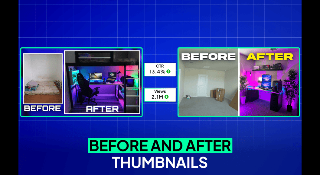
- Show Before-and-After or Transformations: Split the image or show dramatic change. Perfect for tutorials, makeovers, or experiments. Example: Messy room on left, clean on right.
- Use Bright, Saturated Colors: Avoid dull or muted tones. High saturation makes thumbnails stand out in recommendations.
- Focus on One Clear Idea: Don’t clutter with multiple elements. One subject + one message = instant understanding.
- Incorporate Numbers or Urgency: “7 Tricks” or “In 24 Hours” adds specificity and FOMO (fear of missing out).
- Add Subtle Outlines or Glows: Give text and subjects a thin white/black border so they pop from backgrounds.
- Match Niche Trends: Gaming might use bold characters; tech clean minimalism; vlogs emotional faces. Study top channels in your niche.
- Test Emotional Storytelling: Show genuine reactions rather than neutral poses. Surprise or controversy works well.
- Optimize for Mobile: Ensure elements are large enough. Avoid placing important details in the bottom right (often cropped or overlaid by video progress bar in some views).
- A/B Test Everything: Upload multiple thumbnails and let data decide. YouTube Studio supports testing in 2026 monitor which version gets higher CTR.
Quick Framework: Subject (face/object) + Emotion/Contrast + Short Text + Directional Cue = Clickable Thumbnail.
Best Practices and Strategies
- Simplicity Wins: Clutter kills CTR. Less is more—viewers process simple designs faster.
- High-Quality Images Only: Use sharp, well-lit photos. Blurry or pixelated = instant ignore.
- Brand Kit: Create consistent colors, fonts, and logo placement for recognition.
- Promise and Deliver: Accurate thumbnails build trust and improve watch time.
- Iterate Based on Data: Track CTR weekly. Double down on what works for your audience.
- Combine with Strong Titles: Thumbnail visual + title text = powerful hook.
Actionable Checklist:
- 1280×720 size, under 2MB
- High contrast and readable on mobile
- One main focal point
- Emotional or curious element
- Text: 3-5 bold words
- Matches video content
- Tested against 1-2 alternatives
Common Mistakes Beginners Make (and How to Avoid Them)
- Too Much Text or Tiny Text: Overloads the viewer. Fix: Limit words and enlarge font.
- Cluttered Design: Multiple faces or elements confuse. Fix: One idea per thumbnail.
- Low Contrast or Dull Colors: Blends into feed. Fix: Use bright, opposing colors.
- Misleading Clickbait: High initial clicks but low watch time hurts channel. Fix: Deliver what you promise.
- Placing Key Elements in Bottom Right: Can get covered. Fix: Keep important stuff top/left/center.
- Using Generic Stock Photos: Looks fake. Fix: Use your own screenshots or authentic images.
- Ignoring Mobile View: Looks great big, bad small. Fix: Always zoom out to check.
- No Testing: Guessing instead of data. Fix: Create variations and compare.
Avoid these, and you’ll already outperform most new creators.
Practical Examples and Real Use Cases
- MrBeast-Style: Bright background, his shocked face, huge text like “$456,000 Challenge”. Result: Massive CTR through scale and emotion.
- Tutorial/How-To: Before-and-after split with arrow. Example: “Room Makeover in 1 Hour” – shows messy vs clean. Great for lifestyle or DIY.
- Question Thumbnail: Close-up face with text “Is This the End?” for drama or review videos.
- Tech Review: Clean product shot with “iPhone 18 – Worth It?” Minimal text, high contrast.
- Gaming: Character reaction + “I Beat the Hardest Level”. Exaggerated emotion.
Study channels like Peter Santenello (curiosity questions), Mark Rober (fun experiments), or MKBHD (clean tech). Adapt their styles to your niche.
Tips to Improve Results with YouTube Thumbnails
- Start simple and evolve as your skills grow.
- Create 3-5 variations per video and test.
- Update old thumbnails on evergreen videos for a quick views boost.
- Use consistent lighting and editing style for a professional look.
- Analyze competitors: Screenshot top videos in your niche and note common elements.
- Track progress: Aim to improve average CTR by 1-2% every few months.
- Combine with better titles and consistent uploading for compounded growth.
In 2026, AI tools can speed up ideas, but human creativity + testing still wins.
Top Tools and Resources for YouTube Thumbnails
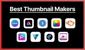
Here are the best beginner-friendly tools in 2026. Start free, upgrade as needed.
1. Canva The #1 choice for beginners. Thousands of YouTube thumbnail templates, drag-and-drop editor, free elements, fonts, and AI features. How to use: Search “YouTube Thumbnail” template, customize with your images/text, export at 1280×720. Perfect for quick, professional results without design skills.
2. Adobe Express Free online tool with polished templates and effects. Great for brand kits and quick edits. Use when you want more advanced photo effects than Canva. Mobile app available.
3. Photopea Free browser-based Photoshop alternative. No installation needed. Ideal for precise edits, layers, and advanced effects if you outgrow basic tools. Use for custom manipulations like adding glows or removing backgrounds.
4. Leonardo.ai or Other AI Thumbnail Generators AI-powered for generating backgrounds, images, or full concepts from text prompts. Use when you need unique visuals fast (e.g., “shocked face with yellow background”). Combine with Canva for text overlays. Great for testing many ideas quickly.
5. Your Video Editor (CapCut, DaVinci Resolve, or Premiere) Export frames directly from your video as high-quality screenshots. Free options like CapCut have built-in thumbnail tools too. Use for authentic, on-brand images from your footage.
Bonus Resources: YouTube Studio for A/B testing and analytics; free stock photo sites (with proper licenses); ThumbnailTest.com or similar for inspiration and guides.
How Beginners Should Use Them: Start with Canva for 90% of work. Learn one tool deeply before adding others. Practice 5-10 thumbnails to get comfortable.
Key Takeaways
- YouTube thumbnails are powerful for increasing clicks and helping the algorithm push your videos.
- Focus on contrast, emotion, simplicity, and clarity.
- Always use 1280×720 size and test on mobile.
- Follow the 15 tricks: bold text, faces, curiosity, directional cues, and more.
- Avoid clutter, clickbait, and low contrast.
- Use Canva + testing for fast results.
- Consistency and data-driven iteration lead to long-term growth.
Creating great thumbnails is a skill that improves with practice. Start applying these YouTube thumbnail tips to your next video today you’ll likely see more clicks within days.
Experiment, track your CTR, and refine. Your thumbnails can become one of your strongest growth tools in 2026 and beyond.
Now go create your next clickable thumbnail! If you implement even half of these strategies, you’ll be ahead of most beginners.
FAQs
Here are the most common questions beginners ask about YouTube thumbnail tips in 2026:
Q1: What is the exact YouTube thumbnail size in 2026?
A: Use 1280 x 720 pixels (16:9 aspect ratio). The minimum width is 640 pixels. Keep file size under 2MB. This size works perfectly on mobile and desktop.
Q2: How many words should I put on a YouTube thumbnail?
A: Keep it to 3–5 bold words maximum. Less is better. The text should be large, easy to read even when the thumbnail is small, and complement (not repeat) your video title.
Q3: Should I include my face in every thumbnail?
A: Not always, but faces with strong emotions (surprise, shock, joy) often perform very well because they create instant connection. Use your face when it fits your niche and brand especially in vlogs, reactions, or challenges.
Q4: What colors work best for YouTube thumbnails? A: High-contrast combinations like yellow + black, red + white, or bright backgrounds with dark text. Bright, saturated colors help your thumbnail stand out in YouTube’s feed. Avoid dull or muted tones.
Q5: Do I need to use text on every thumbnail?
A: No. Some of the best-performing thumbnails rely on strong visuals and emotion alone. Add text only if it adds clear value or curiosity. When using text, make sure it’s readable at small sizes.
Q6: How can I test which thumbnail performs better? A: Create 2–3 versions of your thumbnail and upload them one by one (or use YouTube’s built-in testing features if available). Check CTR (Click-Through Rate) in YouTube Analytics after 24–48 hours and keep the winner.
Q7: Is clickbait okay for thumbnails?
A: Mild curiosity is fine, but extreme misleading thumbnails hurt your watch time and long-term channel growth. Always deliver what your thumbnail + title promises.